Maybe I've just been doing this far too long, but when did smartphone design become so boring? Internal hardware has never been better and we're rocketing off into a new era of 5G, but the industry is stuck in a rut aesthetically.
Take the new Samsung Galaxy S20 range, for example. While some are rejoicing at the return of the flat display, the handset looks much more generic as a result. Part of Samsung's signature design over the last decade is lost, possibly forever. The company also makes no attempt to beautify its camera enclosure. Opting instead for an ugly Google Pixel-esque square bulge on the back. The phone looks so unappealing, especially in that brutalist cement gray. What happened to creating beautiful things?
To be fair, Samsung certainly isn't the worst offender for dull derivative designs. That title belongs to the horde of Chinese manufacturers. Vertical protruding rear camera housing? Check. Ceramic and partial glass body? Check. A notch or cutout display with minimal bezel? Check. It doesn't help that many of China's brands are subsidiaries of BBK Electronics. Oppo, Oneplus, and Realme share resources. Even so, glance at the various phones below and tell me they couldn't also be from the same brand.


Aggressive competition grants every manufacturer access to the latest technologies and manufacturing processes. It's a blessing and a curse. As a result, few manufacturers cultivate anything resembling a unique look. Sony, Motorola, and gaming phone brands perhaps make the cut, but they aren't exactly top of the pecking order anymore. The Huawei Mate 30 Pro is perhaps one of the most unique phones to behold and handle in recent years, but few ever saw it.
The industry's latest and greatest innovation is to offer phones in an array of funky colors. Don't get me wrong, I'm partial to a striking splash of color myself, but smartphone design shouldn't descend into winning consumers over with the most exciting paint job. These aren't children's toys we're talking about. Great design is about both form and function, blending the two to create something that stands out from the crowd.
Is the form factor really that perfect?
Ah but a phone is a phone, I hear you say. There's only so much that can be done with what's essentially a big screen with a camera on the back. It's true that there are limitations on the form factor, and we definitely don't want to see more gimmicks no-one asked for. Remember modular phones? However, most manufacturers play it too safe, refusing to embrace features that some consumers would really warm to.

As an example, the push for ultra-thin bezels means that consumers miss out on front-facing speakers. Metal has made way for the still niche wireless charging trend. We even have the Mate 30 Pro clumsily incorporating button functions into the display, while LG's excellent rear volume rocker idea is left to be forgotten. I don't profess to have the answers, but it's these seemingly small features that make a phone stand out.
I'd gladly exchange slow wireless charging for just a flash of gorgeous metal.
As another example, larger image sensors require more room. Most manufacturers build protruding camera housings instead of embracing slightly thicker phones with bigger batteries and no camera bump. But is that the best solution? See how nice the back of the LG G8 and Huawei Mate RS Porsche Design look with a flush camera housing compared to the Pixel 4, iPhone 11, and Galaxy S20.
Smartphone designers weigh up how technological choices affect aesthetic design. Over the past few years, most companies have favored a few select features, mainly cameras and thin bezels, over other excellent features and more interesting designs. Myself, and probably a few others, would be quite happy to see things mixed up a bit more.
Foldables offer hope, maybe

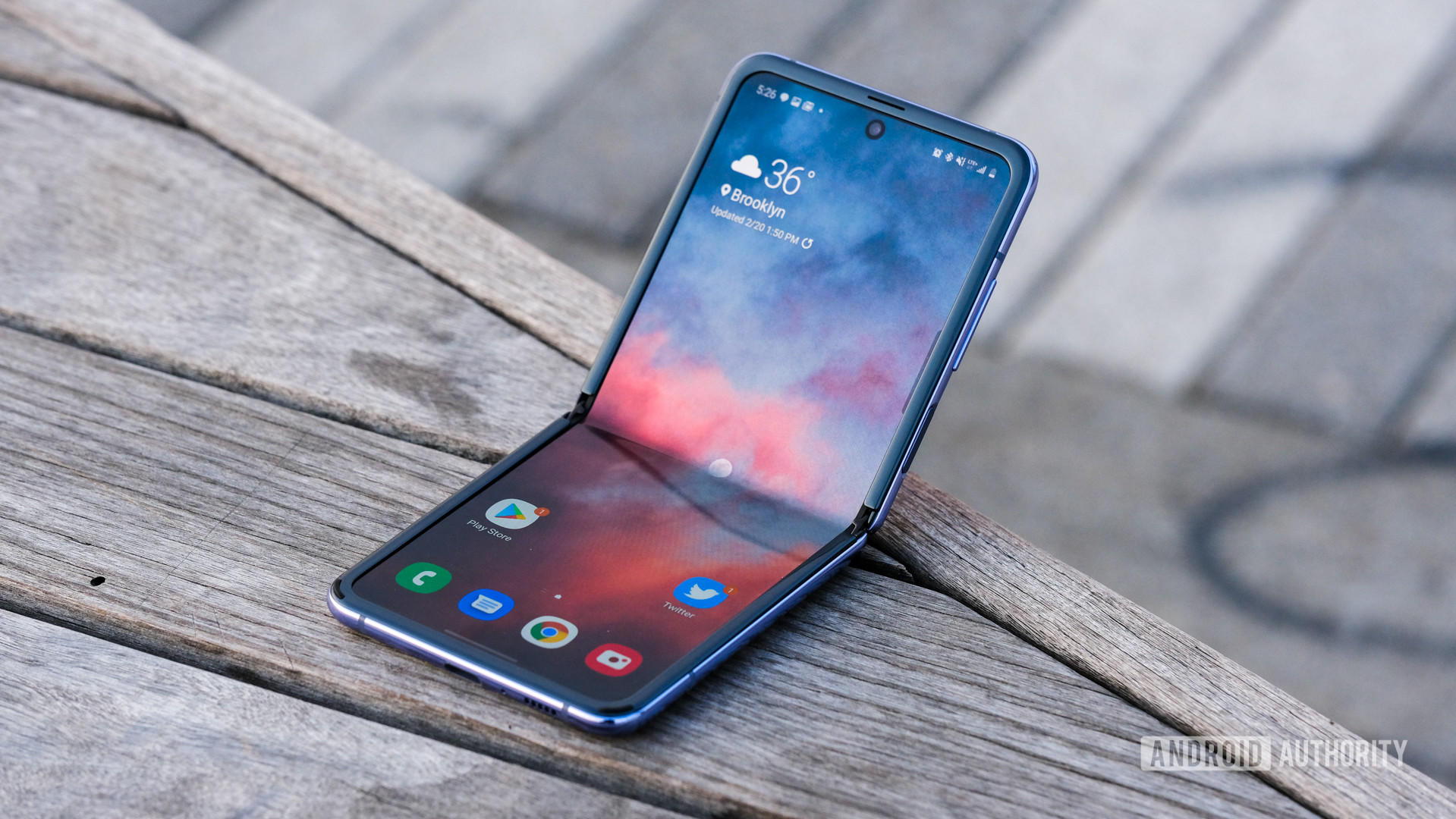
There's an obvious exception to my criticism of boring designs in today's smartphone market — foldables. The reason why there's so much interest in these phones is because they're so different, eye-catching, and perhaps even a better form factor than current designs. A little nostalgia for the clamshell is probably a factor too.
Of course, there's a risk that foldables may too one day coalesce around a common design philosophy. At least for now, the space is wide open to experimentation. Hopefully we'll continue to see some interesting ideas as developers figure out how to get the most out of devices that can function both open and closed.
At the very least, foldable phones — as well as dual-screen flexibles like the upcoming Microsoft Surface Duo — break up the current design monotony. More choice and variety is reminiscent of the pre-smartphone era, which I can fully get behind.
Bland will never beat iconic
My overall gripe really centers on two current trends in the mobile industry. First, ugly flagship designs that seem to disregard aesthetics and design innovation. Secondly, more affordable handsets that are virtually carbon copies of one another and refuse to try something more interesting.
Great, iconic designs are a marriage of both form and function.
I think these are both symptoms of an industry playing it safe. Flagships feel the need to push the spec and camera envelopes, regardless of what the phone looks like. Meanwhile, more affordable handsets have very little profit margin to spend money on novel ideas or design innovations.
It needn't be this way though. In a market increasingly saturated with identical hardware specs and visuals, creating something more unique will easily stand out. Manufacturers should aim to build the next iconic smartphone, not play it safe with a design that will ultimately be forgotten.
To that end, I'll leave you all with a few pics of some of my favorite, stylish Android handsets. They certainly stand out compared to most recent smartphone launches. To prove my point, I bet you can name them.


No comments:
Post a Comment