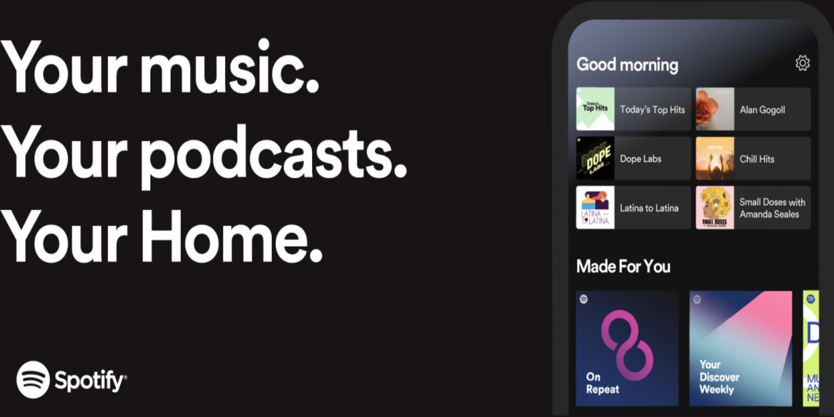
Spotify has updated the home screen on its mobile and tablet apps, putting your favorites front-and-center. This should help Spotify users cut through the swathe of content available and zero in on the music and podcasts they actually enjoy.
Spotify Hosts More Content Than Ever
Spotify has always offered music to listen to. However, in recent years, the streaming service has made a big thing of creating playlists personalized for individual users. It also hosts podcasts, and Spotify even offers a personalized podcast playlist.
What this all means is that there's now more content than ever to listen to on Spotify. But sometimes it's difficult to find that content. However, as detailed in a post on For the Record, Spotify's redesigned home screen should help us all find that content.
How to Navigate the New Spotify Home Screen
Spotify's new home screen greets you with "Good Morning," "Good Afternoon," or "Good Evening" depending on what time of day you log into the app. Directly underneath this is a rotating selection of albums, podcasts, and playlists.
This will change through the day to reflect what you listen to at various times. So, if you normally start your day with a particular podcast, that will make the cut. And if you work out in the afternoon to a particular playlist, that will make the cut.
Ready to move in? Your new Spotify Home is here ? https://t.co/ADCYkRRr40 pic.twitter.com/ZKZJ4JvNsv
— Spotify (@Spotify) March 9, 2020
Under this you'll find your Recently Played, Your Top Podcasts, New Podcast Episodes, Made for You, and more besides. The common theme being that these are all aimed directly at you, being either what you listen to or what Spotify thinks you should listen to.
Making the Spotify App Easier to Use
This all makes your Spotify homepage much more useful than it was previously. And you can be fairly confident that by clicking on Home and scrolling down the page you'll find something worth listening to. And all without needing to use the Search function.
This isn't the only way in which Spotify has improved its mobile app lately. The latest version of the Spotify app for iOS uses simplified icons to make the UI easier to use. All of which should help Spotify battle back against Apple Music et al.
Read the full article: Spotify's New Home Screen Is Full of Your Favorites
via https://ift.tt/2TGf35a

No comments:
Post a Comment